6 quick observations, design recommendations and cartoons for this train trolley system
I've been stuck on what to write first for my new newsletter (more on this later), so there's only one thing to do. Talk about train trolleys babeeeeey!
Short Intro:
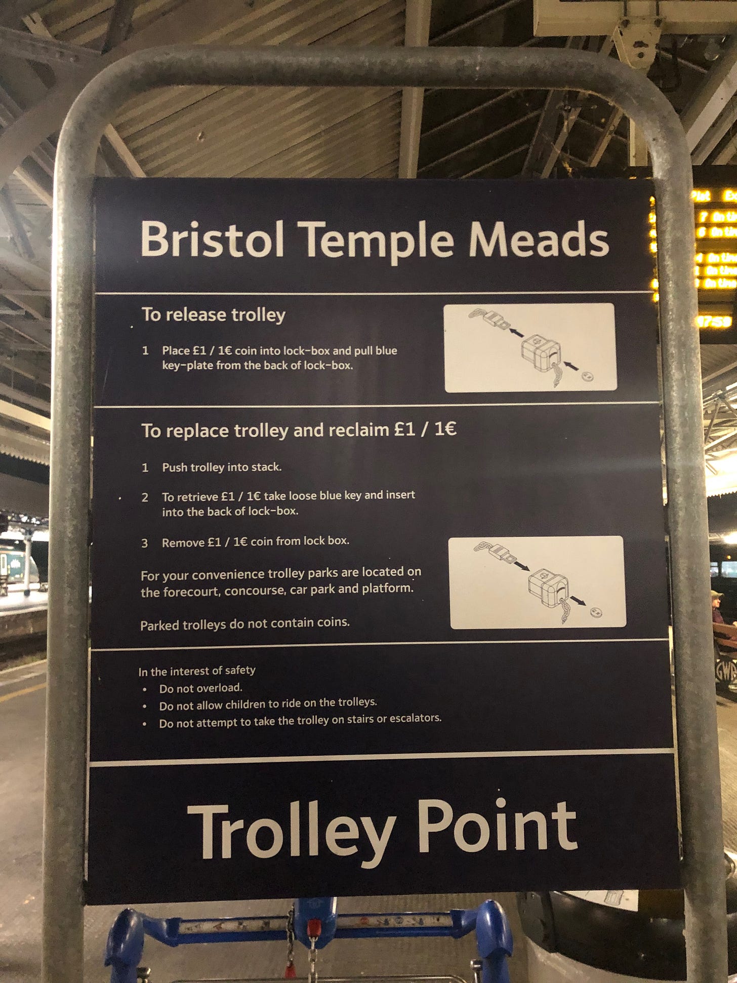
I imagine like most people who have experience in interface design, I can’t help but do a little on-location review of products and labelling I come across. I took this photo of a train trolley sign at Bristol Temple Meads train station this week, which ended up being one of those on-location reviews. In this newsletter I’ve shared my high-level observations and suggestions below, along with some cartoons.
WARNING: These design recommendations must be validated with real users to demonstrate safety and effectiveness. [Especially the screaming trolley recommendation.]
6 quick observations and recommendations:
Safety information first - I’d suggest having the three safety warnings at the top of the sign instead of the bottom, to encourage the user to read this information first. (User Manuals love doing this). I’d also add the ‘why’ behind each statement for additional context, and include the potential consequences of what may happen if these instructions are not followed.
I would consider moving the important ‘way-finding’ information at the bottom of this sign; ‘Trolley Point’, so that it was at the top and replaced ‘Bristol temple meads’. I assume it’s a higher priority to have this information at the top so users can easily identify where the trolleys are stored over a busy crowd of people. This feels more important compared to being reminded which train station they’re at?
I’d suggest to the the sign makers they use real world terms and concepts that users are more likely to understand… For instance what’s a key plate? A forecourt? A concourse?
The inserting component is called a ‘key plate’ which sounds like internal terminology used by the engineers who created the mechanism. (I’d probably suggest just dropping the word ‘plate’, as ‘key’ seems quite fitting and real worldly on it’s own). Additionally, one of the trolley park locations is described as the ‘Forecourt’, which makes me think of a big grand manor house. I’d probably swap this word for ‘entrance’. As for the other trolley park location; ‘Concourse’.. I’d need more time to think about this. *googles concourse*.
The ‘key plate’ is specifically described as ‘blue’ in the text, however the image itself doesn’t reflect this, despite blue being a seemingly feasible colour to print with, as the arrows are coloured blue. Additionally, the real life key plate isn’t blue, it’s red, which is a mismatch. I’d suggest dropping the descriptive ‘blue’ from the text, if there’s no guarantee or strict controls over what trolleys and coloured key plates are being used in the future.
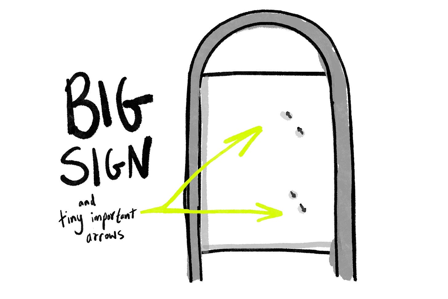
For the two diagrams included on the board, I’d probably have drawn the illustrations from the perspective of the user to make the actions easier for the user to understand and reference. Equally, it seems as if the only difference between the two illustrations is the direction of the two arrows, which is quite hard to distinguish as the arrows are chunky and small.
And then I questioned why there is a pound activating key/lock system in the first place? It’s SO annoying. The pound (I think) is used as an incentive for the user to return the trolley, which is a time and cost saving benefit for the train station who then don’t need to employ someone additional to do this.
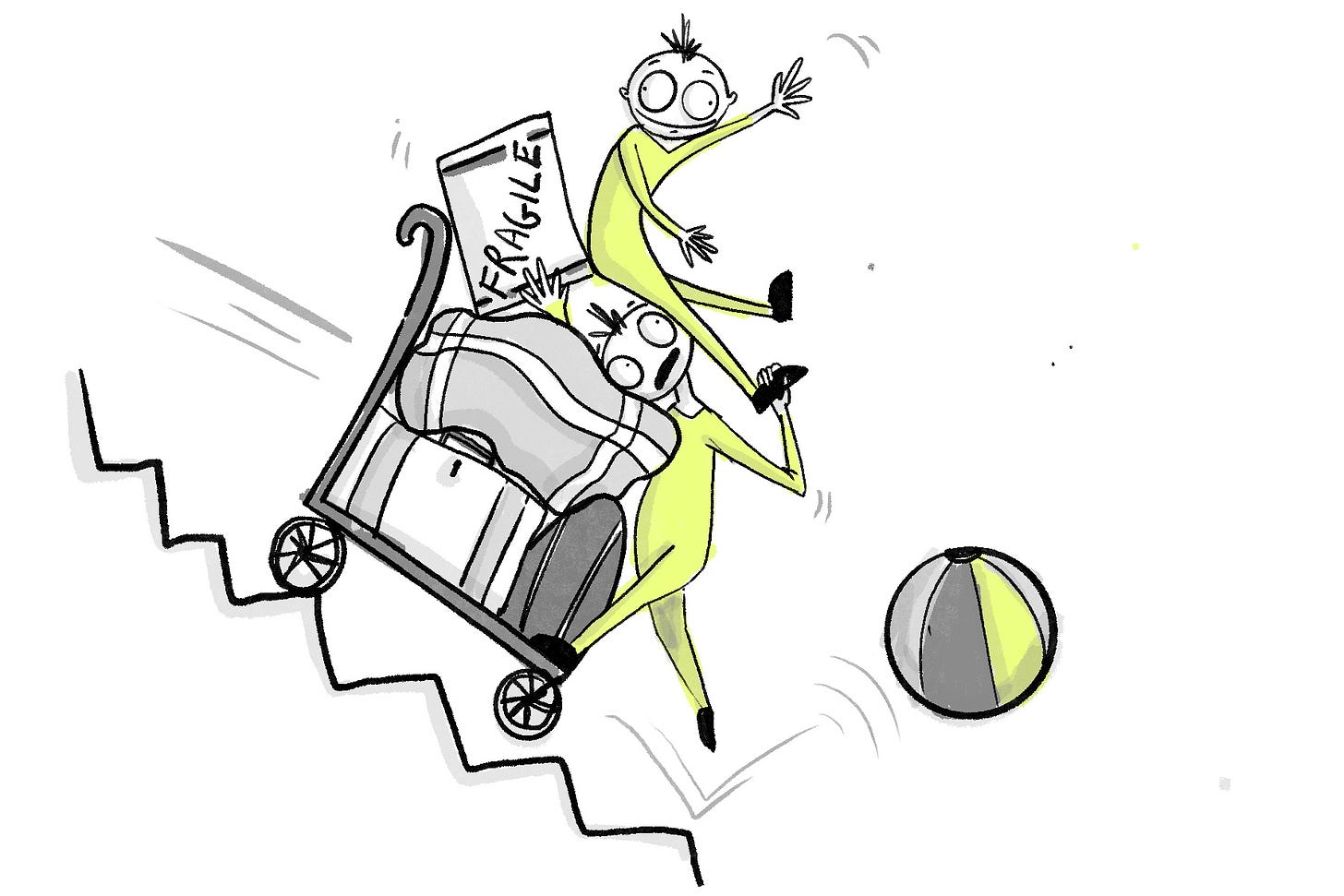
But it’s not a time saving benefit to the user if they don’t have a pound; especially if they miss their train because they were too busy lugging 3 suitcases across the station. See below for four suggestions for alternative solutions:
Ease of use over incentive? Instead of an incentive, how could we make it as easy as possible for the user to return the trolley, to increase the likelihood of return? Perhaps we could trial increasing the number of trolley parking stations along the touch points where users will most commonly pick up and return a trolley, e.g., the entrance/exit, carpark and platform.
What item is more ‘to hand’ and could replace the pound coin? Are there any alternatives to pound coins, that users will more likely to have on them to use for the locking system? E.g. I’ve seen online that house keys can be used as a hack replacement? However house keys come in many shapes and sizes… which is a bit of a tall ask to the engineering team making the lock.
How big is this a problem to be solved? Are users actually not as bad as we think and generally good at returning trolleys without an incentive? Perhaps it’s not even a big enough issue for this design feature to be present…? (This reminds me of judging someones morals via the shopping cart theory - watch more about the shopping cart theory here.)
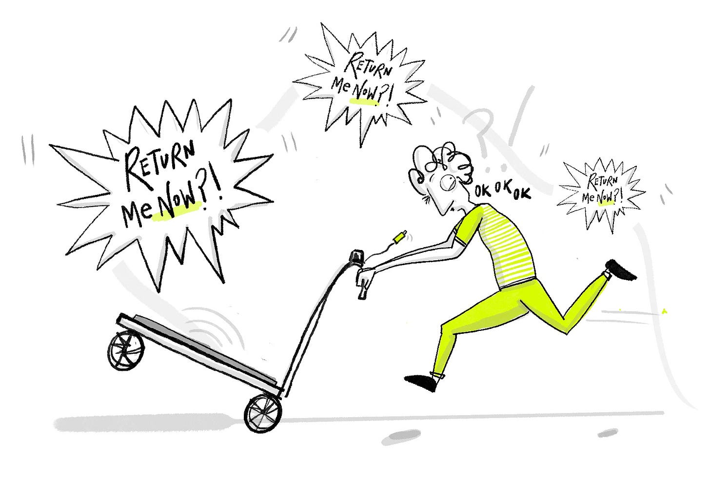
Wild card: Perhaps we can use embarrassment as an alternative incentive to return the trolley. The trolley could have a weight sensor which can sense recent extended use of the trolley, and when items are lifted off there’s a 10 second pause before the trolley screams ‘RETURNNNN MEEEEEEEEE. RETUUURNNN ME.’. (Increasing by 5 decibels every 10 seconds.)
[Note to me - insert hilarious drawing of screaming trolley below]
The End.
So that’s it, that’s my round up of quick thoughts, with a few scattered usability heuristics in there for good measure (learn more about usability heuristics here).
For the half-full cuppers out there, there’s lots of good things about this system too. Such as clear and consistent flow for information from top to bottom, and instructions repeated on the trolley handle too for convenience.
If you have any other wild suggestions or similar thoughts please comment as I’d love to see. What have I missed? Anything you disagree with?
Over and oot!
Subscribe below for more, share this if you fancy or leave me a comment.






I love the illustrations!
Your good note on the diagrams and arrows made me think this might be one of those signs that looked reeaaally nice on someone's screen inside InDesign/Illustrator/tool but did not translate well to the actual location.
Love these in general, Tiia